Making N26's account smarter 🧠
A bit about N26
N26 was the first bank in Europe that could be entirely managed over the phone. Launched in 2015 in Berlin, the company's goal was to reinvent traditional banking by embracing new technology and focusing on providing the best user experience. N26 is now a global bank that keeps growing at high speed.
My Role in The Team
I was hired at N26 as the second UX/UI designer. This project was split in two parts that consisted different teams. During the first part I worked on feature ideation, research and validation together with the Head of Product, another Product Designer, an Interaction Designer and two team members of A&J Smart, an agency focused on running design sprint workshops.
During the second part of the project, I was the designer responsible of evolving the validated ideas to an MVP, working together with a PM and two app developers.
The Problem
During the first 6 months after the app's first launch we had accomplished quite lot very quickly. N26 was the most leading-edge bank in Europe at the time, with a simple and beautifuly designed app with innovative features and a super smooth process to join the bank remotely that attracted over 300k customers. But, as any new product, the challenge was to make these people stick with us.
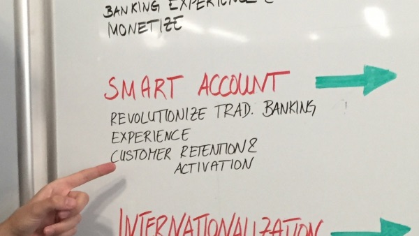
Through user research, we identified that a set of customers were missing –and expecting– more powerful tools to help them understand their financial activity and trends more easily, which was causing them to not perceive N26 as the most complete fin-tech option. We believed that by offering customers a smart bank account with personalised information about their financial activity we would help them manage their finances more easily, improving the brand perception and increasing user engagement and retention.
The Design Process
Our first goal was to validate this concept of 'smart account' was worthwile pursuing, and we wanted to conceptualise, design and validate ideas really fast. Because of that, we decided to conduct a 5-day design sprint with the help of the amazing A&J Smart's team, who facilitated the sessions during the week.
So the first thing we did was meeting with key stakeholders to review our business goals and agree on the long term challenges we wanted to focus on. As a new product we look at customer retention and activation as primary objectives.
Ideation: Brainstorming, voting and prioritising ideas
The first thing we did was to run a user story mapping session to get a bigger picture of our users habits. Based on the resulting flow, we brainstormed solutions and ideas to fill in the gaps that would allow customers to better understand their finances with N26. Then, we dot-voted these ideas and prioritised them based on effort and 'smartness' matrix.
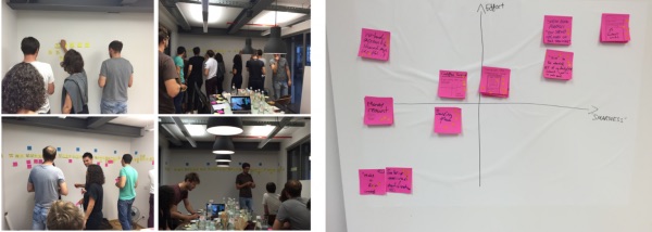
Top 3 voted ideas to explore
✨ Cashflow trends
✨ Smart contextual cards
✨ Smart categorisation
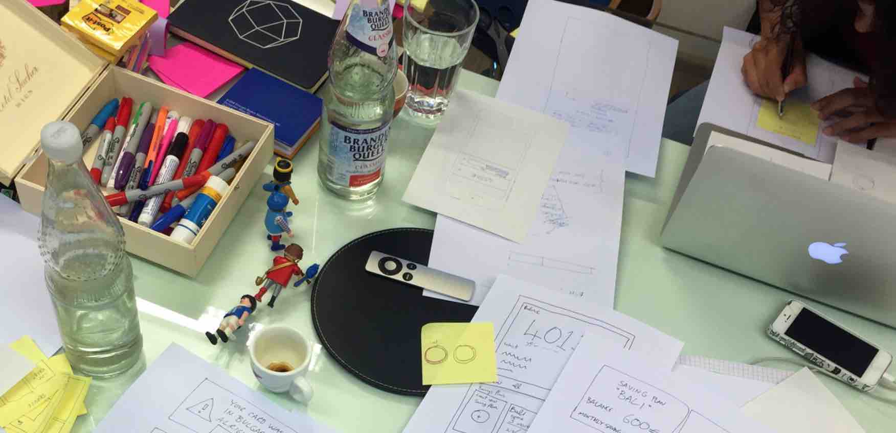
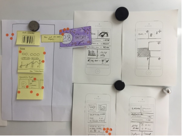
Sketching session
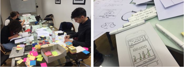
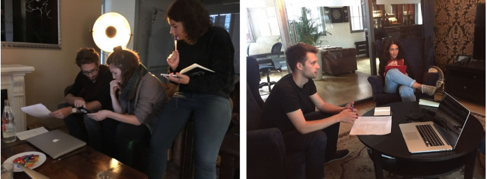
With a clear direction and prioritised ideas to keep working on, we ran a sketching session to visualise the top voted features and discuss particular interfaces and flows. The goal was to decide which key screens should be prototyped for testing.
Validation
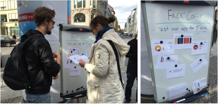
As a next step, we performed a guerrilla user research to validate the ideas. I created and printed different cards to help us understand what kind of ‘smart’ financial information people would be more interested in finding in the app. Here are some examples:
Iteration, prototyping and testing
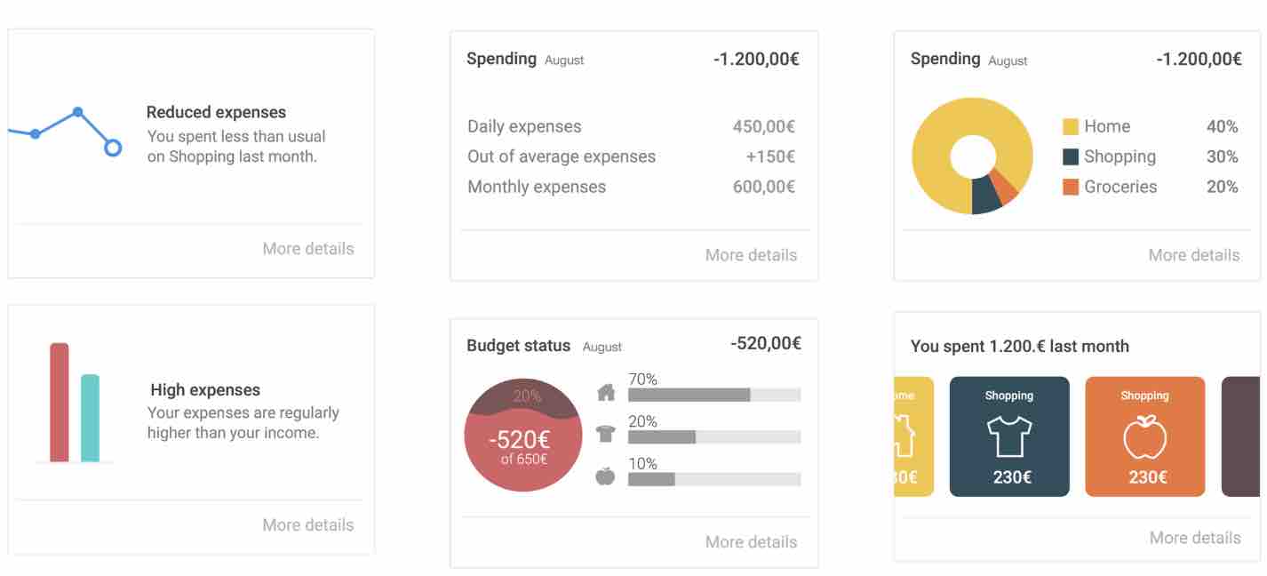
With the collected feedback, I quickly iterated on the ideas that had gotten more interest and prepared a prototype to test the next day. I created a few variants to test different content and types of data visualisation.
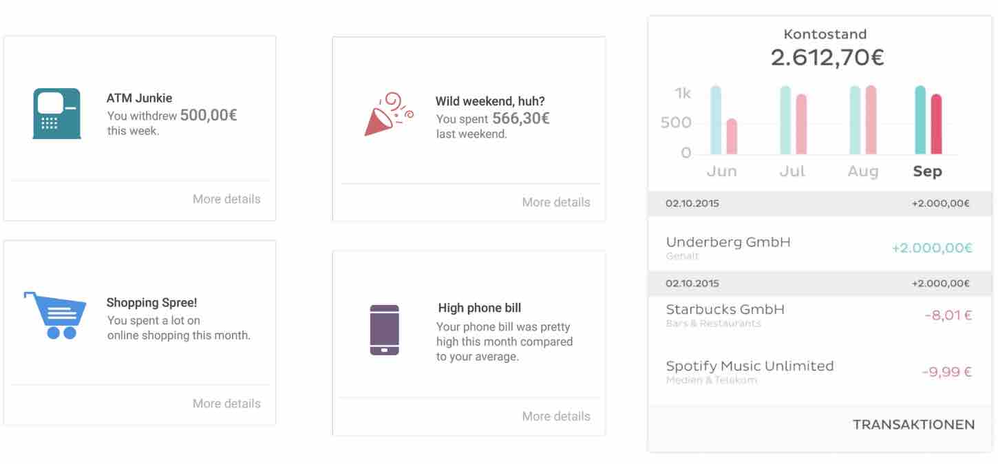
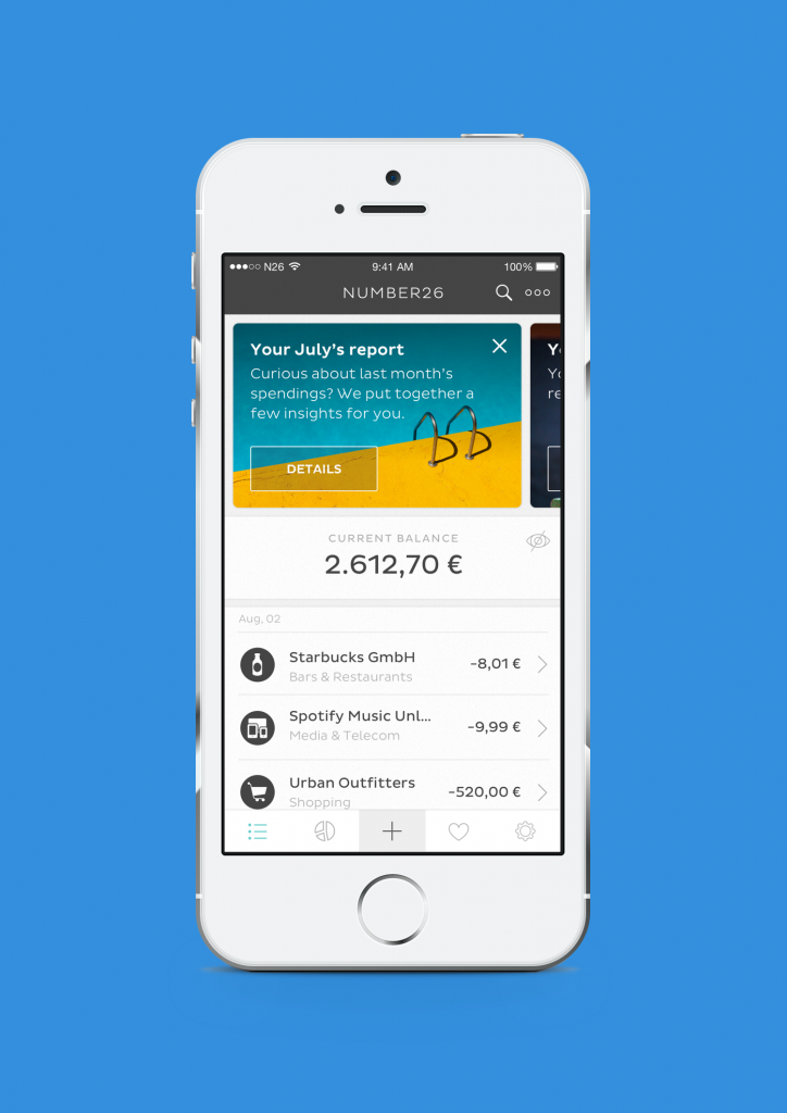
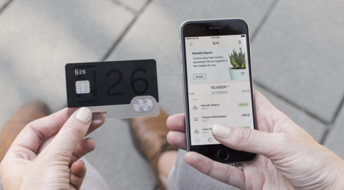
The pieces of information we wanted to test were presented in a 'smart homepage' with the smart contextual cards at the top of the screen. The most successful card had been the monthly report, so I placed it on the first position and made it stand out more than the rest visually, using a season themed background illustration.
On tap, the card expanded and showed the full summary, with a simple cash flow visualisation and insights about the top spending categories.
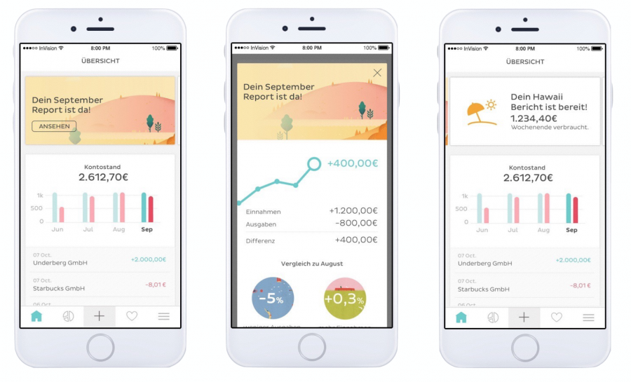
Below the cards section, I placed a cash flow overview comparing data of the last four months and the last four transactions. At the lowest level of hierarchy there was a section showing the top three spending categories.
What we learned
👎 Cashflow Trend
Participants said they'd be happy to see a simple visualisation to quickly understand their financial trends. They wouldn’t mind finding this on the homepage but people still wanted to find the full list of transactions in a primary position.
👎 Smart categorisation
People liked the idea of automated categorised expenses, but they didn’t consider it would be 100% accurate, nor cared a lot about it. They didn’t find a fixed section in the homepage particularly useful, again they mainly wanted to see their transactions list, though didn’t mind it as a type of card or finding it within the monthly report.
👍 Smart contextual cards
The contextual cards were very well accepted. As we had seen in the guerrilla test, people loved the monthly report. Most participants told us they would open the app to check it out. On the other hand, all participants rejected negative messages like “You spent more than usual last weekend” or “Here’s your Holidays expenses summary”. They wanted to findd positive or neutral information on the cards
Based on these findings, we confirmed that showing personal and relevant information about users financial activity, as well as fun facts snippets placed at the top of the homepage using the card component was a good and flexible solution that would allow us to help customers better understand their financial activity while making them more keen to come to the app to learn more.
Designing the MVP
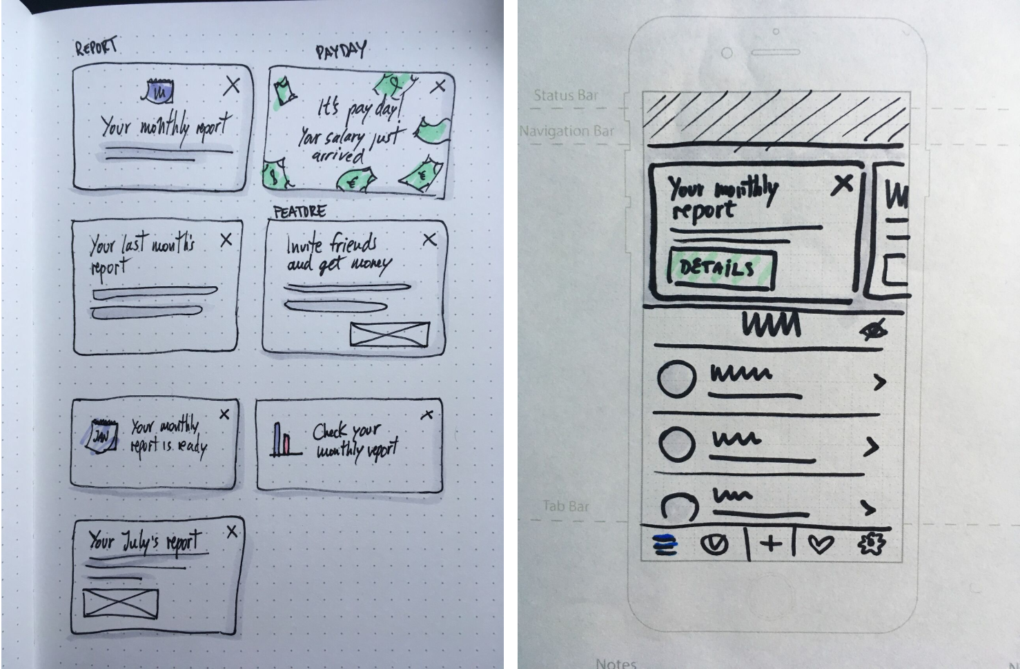
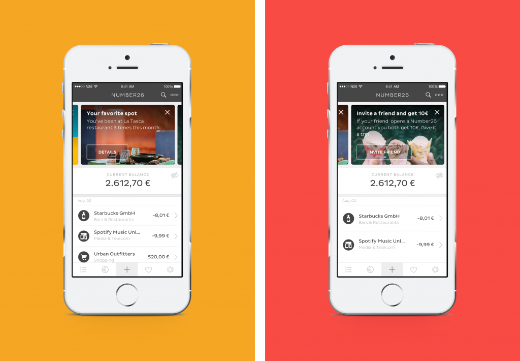
After analysing the research results I mapped three different types of information that would be displayed in the cards. The two key bits of information were data related (e.g. “You spent 100€ less than last month”) and ‘fun facts’ (e.g. “It’s payday!”), but we also wanted to take advantage of the cards versatility to announce new features or products (e.g. “Invite a friend to N26 and you both get 10€”).
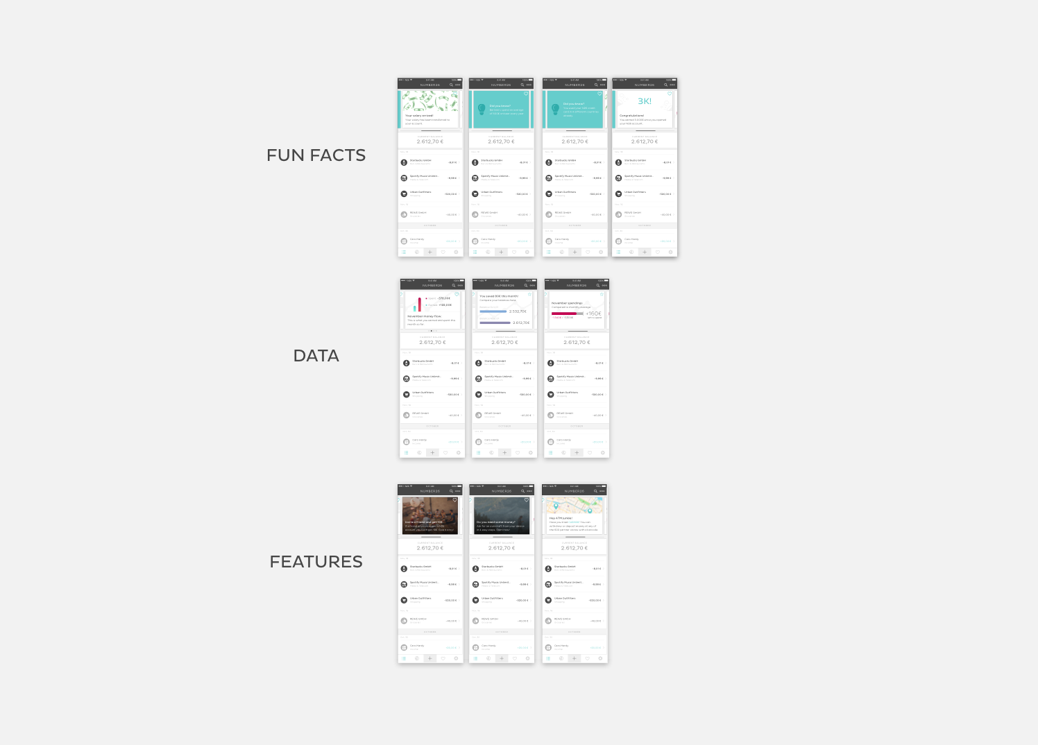
I started the designs exploring the idea of using different UI patterns for each type of information. My assumption was that this would help users to identify each type of information quicker. However, during usability testing I realised that this actually added visual noise and people didn’t understand why the cards were different, they perceived all cards as a single type of notification in which the app was communicating something relevant to them. From a tech perspective it was going to be easier to start with only one design for all the cards, so I kept exploring a single pattern.
Another assumption I was proven wrong was that people would be familiar with the horizontally swipeable cards pattern and that they would understand that the cards were tappable. To my surprise, I found some people wouldn’t tap or hesitated, so I added buttons to the cards to make it clearer. This also helped to better communicate the action that would be triggered afterwards.
In terms of visuals, I got better feedback on the cards with background images over the white cards with icons. People focused more their attention when they saw a nice picture, so I continued developing this design. It was a challenge to
find the right type of image that allowed the text to have good readabilty. I used Unsplash to select the photos since we didn’t have resources for self production (you know those early startup days!).
Final design and development
We decided to start shipping the monthly report so we could measure success before building the other type of cards. We'd be looking at open rates, dismiss events and app logins at the end of the month.
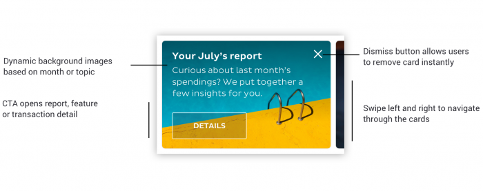
Below you can see the design specs of the final card component, which the marketing team called PULSE26. As you can see the main elements of the card were a contextual background image with a black gradient overlay on top for readability, a title, a paragraph, a CTA and a button to dismiss.
Results
We got positive customer feedback and high open rates of the monthly report, which gave us confidence to continue building and shipping the rest of the cards. 5 years later the cards are still a feature in the N26 app and a way to communicate and show relevant information to users.
A personal takeaway of this project was realising how valuable a 5-days design sprint can be to efficiently prioritise tasks and reduce months of work into a few weeks.
Testing and sketching session pictures credits: A&JSmart